Lunar
Lunar
From underdog outsider to alternative insider
Services
- Concept
- UX/UI Design
- Development
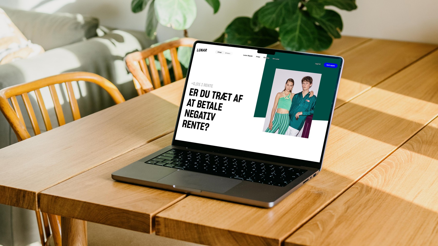
We helped Lunar transform from just an app to a bank with a wide range of services, in a completely new way. Time spent on the “About” and “What’s in it for me” pages has increased by 67% - Mobile conversion experienced a stable 47% increase in conversation and on desktop we saw a whopping 375 % increase.
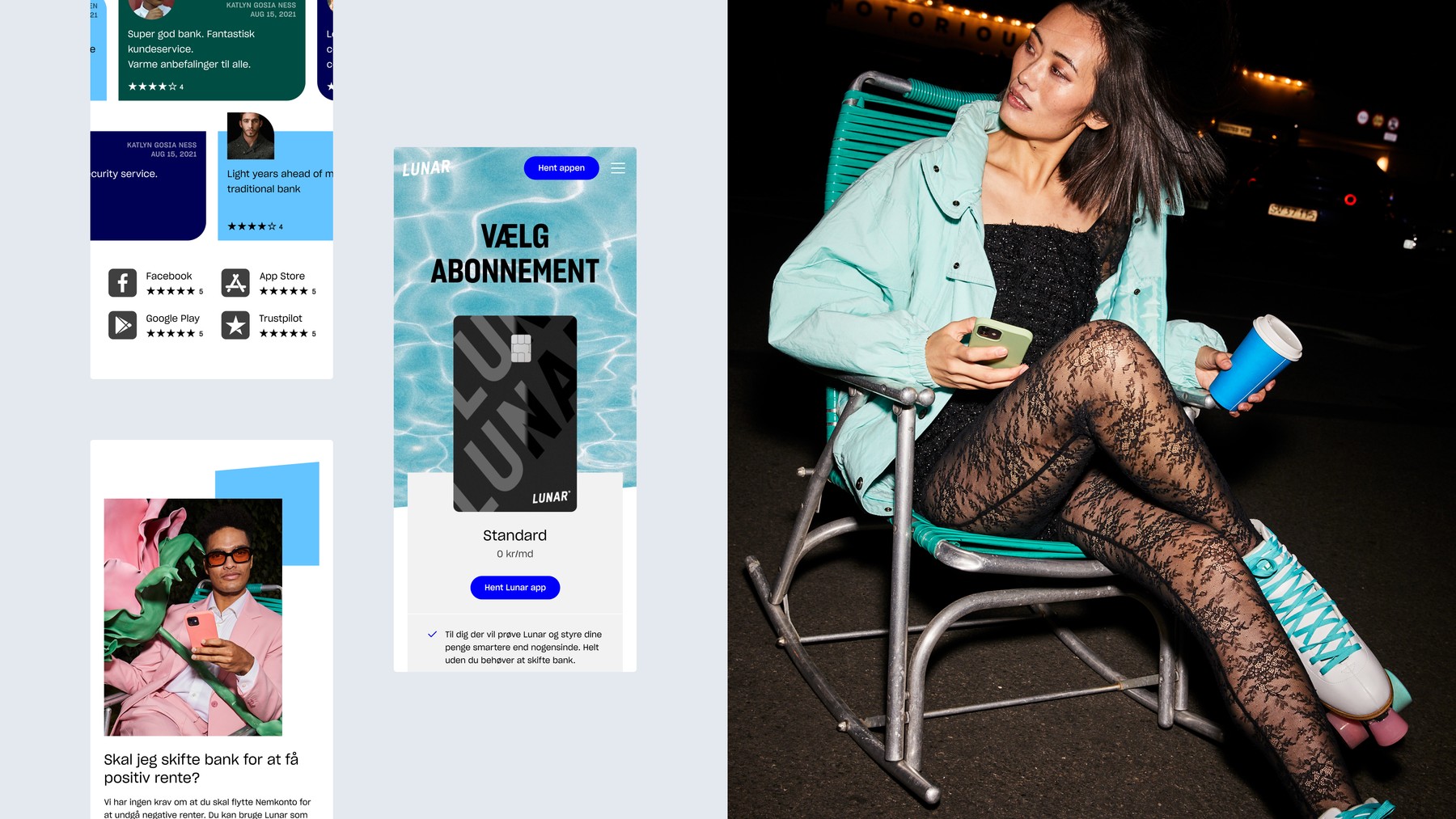
From a tech startup to a full-grown bank
The Challenge
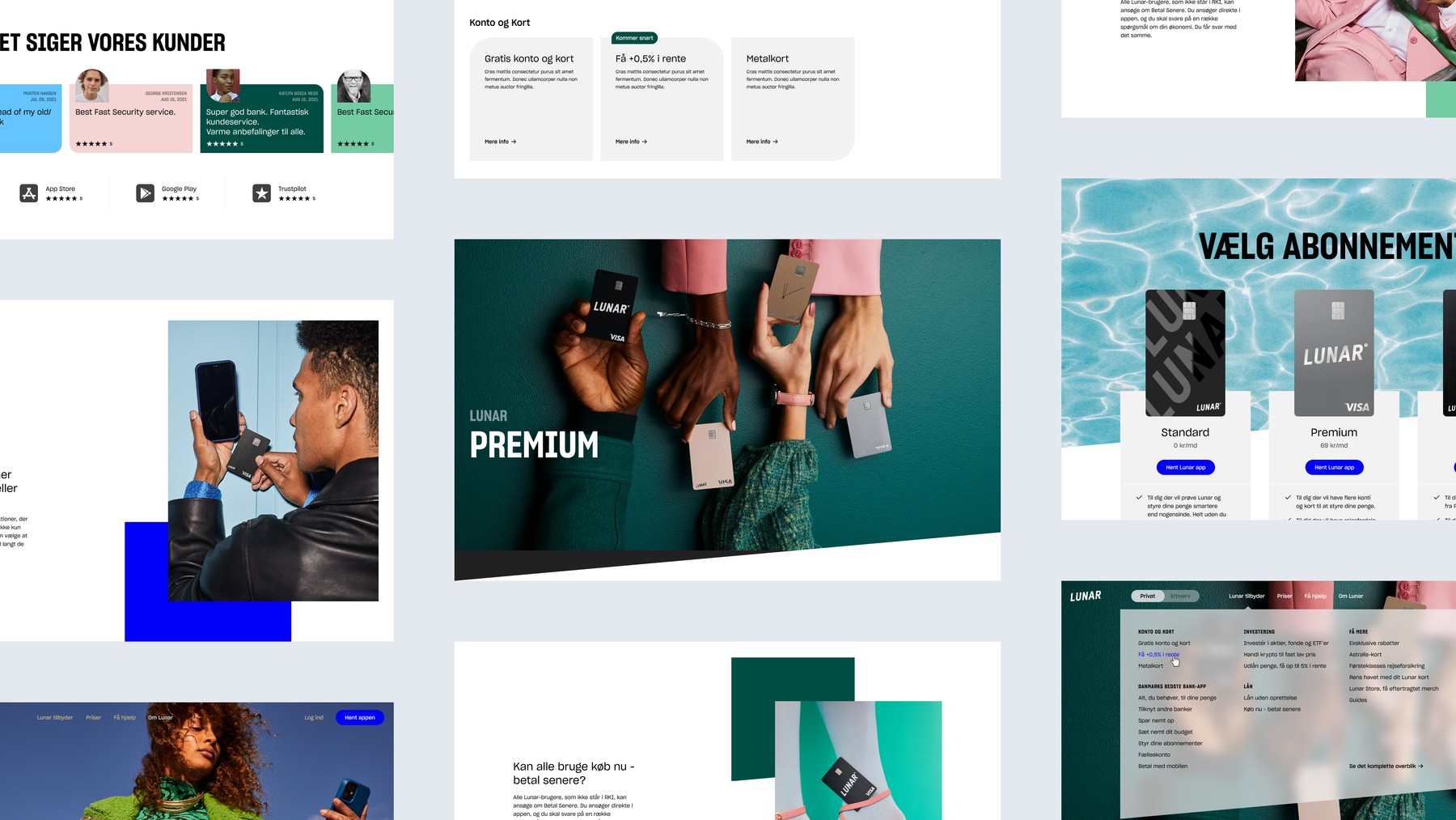
Lunar has been successful in attracting young customers with a compelling app and payment cards in funky colours. And has grown from being a tech startup to a full-grown bank. At Lunar, customers have full control over their own money, with positive interest rates, a number of fee-free services and an app experience that makes it possible to manage your own finances with a few clicks. But their site hadn’t followed suit.
Simple, vibrant and user-friendly
The Solution
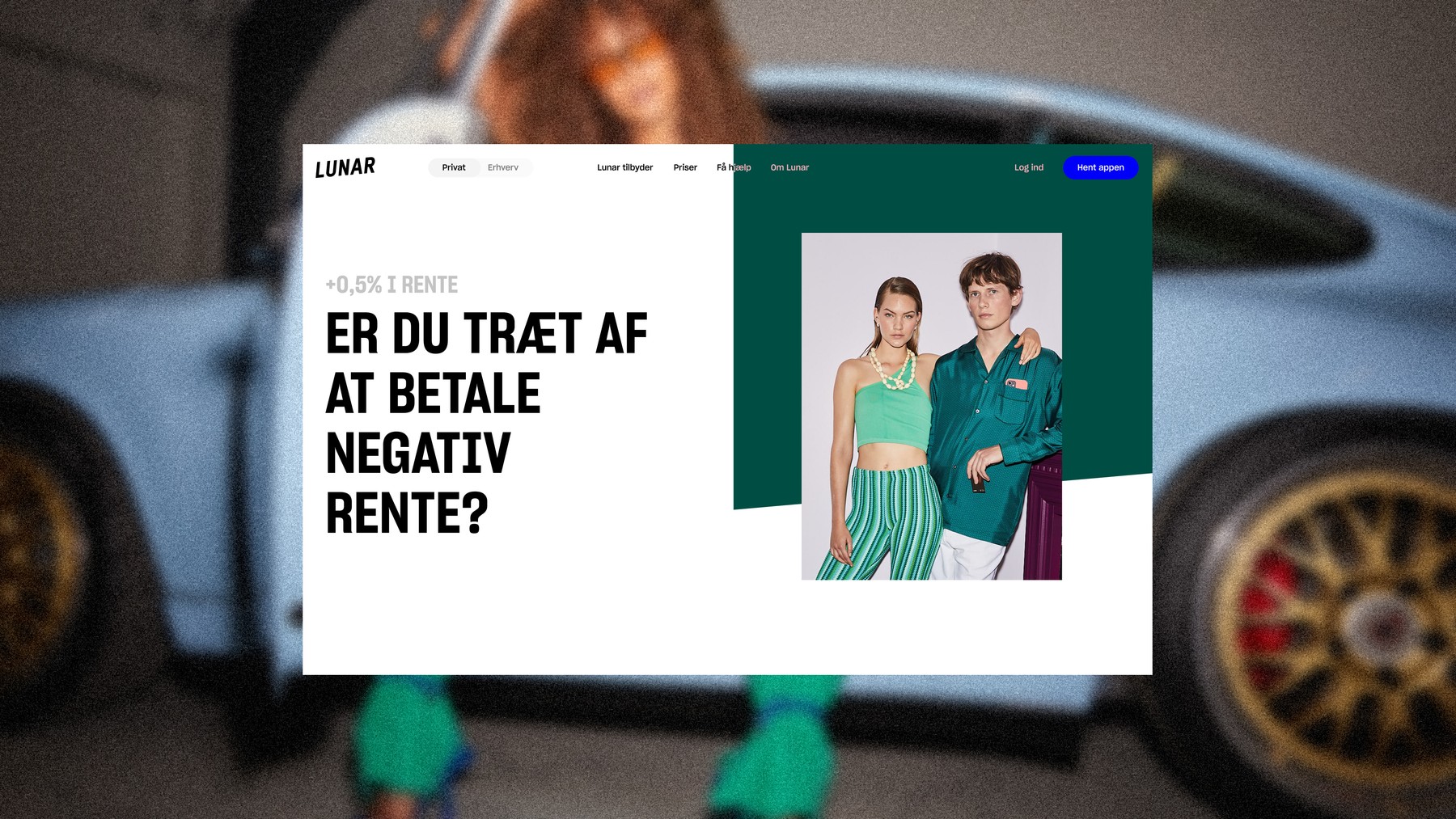
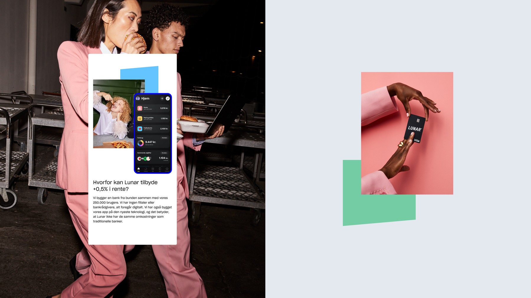
Old banks are built for the past. Lunar is built for the future. This is Lunar's philosophy in a nutshell, and it is also the main idea behind the design of the new website. The site’s deliberately simple and conservative navigation is user-friendly and reassuring. And its design stands out from other blue collar-banks, with a vibrant colour palette and contemporary photography.
